Home › Forums › Creative Content › Hey Guys, would like your comments
- This topic has 21 replies, 11 voices, and was last updated 17 years, 1 month ago by
Anonymous.
-
AuthorPosts
-
-
22/02/2007 at 11:54 pm #5871
Anonymous
InactiveHey guys im currently doing The "BTEC National Diploma In Interactive Game Devlopment" course at Belfast Institute, i am currently working on a 3d environments project (created inclusively in 3D Studio Max) and have selected to remake the resident evil mansion entrance, i am quite happy with the way its going but would love any comments from you guys on how i could make it better, i still have all my original resident evil carpets to put down and various decor but heres how it looks so far:
(there is lots more to do and this is my first real big scale modeling)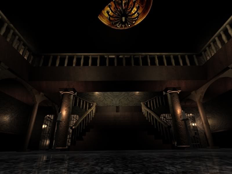
-
23/02/2007 at 1:29 am #35729Inactive
Welcome to the community, GH0000ST. Back in the day I attended BIFHE for three years. It’s a great place to be. I hope you’re making the most out of your time at the tech and are enjoying it. At some point you may want to write up a review of the course to explain the good and bad points.
Good luck with the WIP. I’ll have a check to see how you’re getting on with it.
-
23/02/2007 at 10:47 am #35735Inactive
model first, then lightning and then textures (and then looong and painful tweaking of the all :)
try using the GI renderers (brazil, vray and so on) because at the moment looks really ‘old-dated’
cheers
ps. i think the second storey (or how ever u call it :) is too low – i mean – something wrong with proportions – use biped (or other human sized figure) to get it right
ps II. will be watching :)
-
23/02/2007 at 12:36 pm #35745Inactive
The order i made this model was modeling, lighting then texturing, adding things like carpets would be what i call tweaking, although i dont know what you mean by old dated, if you mean the look of the mansion thats what i was going for as if you play resident evil games they try to give you a feeling of no-one has been there for a while, and the mansion it self is a brave age, as for the renders i am currently using mental ray and no more renderers can be added mainly because they are the colledges computers and i have a later version at home so using this file at home would make it incompatable (although i do agree with the second floor being a little too low and will be having a look into it once i have all the major things done), maybe some one could help me with this tho, i want to bring a certain "dustyness" and have the ray of the moon showing through the window:

-
23/02/2007 at 1:18 pm #35751Inactive
Looks Pretty :)
-
23/02/2007 at 1:44 pm #35753Inactive
well – by ‘old-dated’ i’ve meant that it looks like renderers form far afar in time (like 10 years or so :)
i dont like the overall tone of the image – everything is brownish/greyish – look at the concept you’ve showed us – theres plenty of colours (some of them quite strong) – even if its old mansion – there are some objects that would attract ones attention – yours is a bit sterile at the moment
i think tiles would look better on the floor than those carpet-like patterns (or – if its carpet – it cant reflect – can it :)
anyway – cheers and keep it up :)
-
23/02/2007 at 3:18 pm #35757Inactive
thats where i would have to totally disagree the image as you said IS a referance and not what i wanted my final peice to look like, the darkness of the scene is perfect for the function it was intented, to resemble a horror game, ie resident evil which is dark and atmospheric, which i think this image brings across, maybe your not familuar with the resident evil games but they all try to bring over a sence of darkness and fear, making it like the image would take away from what i am trying to achieve and as i said it is a work in progress and much is still and will be done

-
23/02/2007 at 5:26 pm #35759Inactive
Hi Ghooost
Your renders are looking very cool. The Game cube remake of resident evil one could be good reference for you to have a look at. They really changed the look of the game quite a lot, it’s in a very similar mood to what you are trying to achieve.
Cheers
Paul
-
23/02/2007 at 6:10 pm #35760Inactive
thanks buddy couldnt find any good pics of teh game cube mansion but thats exellent, :D
-
01/03/2007 at 1:25 am #35813Inactive
Just a quick update

-
01/03/2007 at 7:42 am #35814Inactive
Max beat me to the punch on that one, the GC version would be excellent reference if you could get your hands on a copy. You also need to add a Fresnel mask to the reflection on those floors, its too strong, I’d also make the glows on those chandeliers softer. Nice work though, keep us updated as you work through it.
-
01/03/2007 at 10:10 am #35820Inactive
Looking better – good stuff!
-
01/03/2007 at 3:56 pm #35822Inactive
Looking good Ghooost.
Are you rendering out your scenes, or are you trying them out within a game engine in real-time?
Regards…
Mal -
02/03/2007 at 10:33 pm #35845Inactive
This is looking cool, I LOVE the remake. If you need grabs, just ask, cause I use my laptop screen as my TV.
-
04/03/2007 at 1:30 am #35857Inactive
hey mal, these are just renders from 3ds max but with a few modifications it may make a very interesting "cando" race track :wink:
looking at the gamecube remake of the game it seams very pale and colourless, so i added a night lume effect to the lens in the mental ray renderer, i think it gives it a nice aged atmosphere what you think? with or without as its hard to find a good atomsphere effect, although it seams to make the lights on the wall too bright so ill try adjusting the multiplyers in the morning, i also may turn the ambiant light down a tad as with the night effect it seams to lightin the whole room as well as give it a white wash and now its too bright, now its sleep time :lol:
-
04/03/2007 at 11:52 am #35858Inactive
Latest render looks good.
Previous renders had far too much depth of field blurring going on, which completely ruined the scale of the image. Made it look like a small model or something.Nice progress though…
-
04/03/2007 at 11:59 am #35859Inactive
Also atmosphere doesn’t come down to just adding an effect. It involves lighting, textures and colors.
The atmosphere created in the Res Evil remake was excellent, and it was due to excellent use of light/shadows and also the sort of washed out, desaturated look it had with its textures and colors.
I wouldn’t rely too much on Mental Ray shaders/filters for now, just concentrate on your lighting and textures. Try change the light colours to a sort of blue hue, or maybe create more light coming from outside to simulate a full moon(again, a bluish tint to the lighting).
In the end it’s personal taste, but never underestimate the importance of lighting in creating the correct atmosphere.EDIT: Also one more thing, I could be wrong, but it looks like you are using raytraced shadows in your scene. You should really use shadow maps for artificial lighting. It makes the shadows softer which is more natural. Sharp shadows(ray traced) are mainly used to simulate the shadows created by sunlight.
-
04/03/2007 at 7:38 pm #35862Inactive
From that last render it looks like your walls are being mapped in planar screen space, is this intentional?
-
04/03/2007 at 11:01 pm #35866Inactive
Hi,
GH000ST, FYI I sent you an email.
Nice work.
-
05/03/2007 at 2:00 am #35867Inactive
From that last render it looks like your walls are being mapped in planar screen space, is this intentional?[/quote:532021eca2]
Yeah, I noticed that too. Very odd looking. The scaling on the wallpaper pattern seems very big too. I would tile that down.
I think maybe changing the chandelier would be good too, the proportions of it just seem very off, and it’s the first thing you notice when you see the render.
A good first try at big scale modeling though.
-
05/03/2007 at 5:10 pm #35881Inactive
would that be why it looks like the wall paper is all facing the same way? i wondered that my self but have just been getting other things out of the way first, would you recommend a box uv map? and thanks for all your input guys i feel i can really use alot of it in the future
-
05/03/2007 at 8:34 pm #35882Inactive
If you’re using Max, make sure that you’re wallpaper texture has not been set as an environment map rather than a texture map. Box mapping might work, depending on your geometry but if you want to do it right, making sure you don’t get seams in the corners, try planar mapping each wall seperately and manually aligning the wallpaper across the 90 degrees, time consuming but ultimately worthwhile.
-
-
AuthorPosts
- The forum ‘Creative Content’ is closed to new topics and replies.