Home › Forums › Creative Content › Tolkien’s Troll (bust / wip)
- This topic has 14 replies, 10 voices, and was last updated 14 years, 3 months ago by
Anonymous.
-
AuthorPosts
-
-
03/03/2010 at 11:32 am #7640
Anonymous
Inactive -
03/03/2010 at 10:32 pm #45397
Anonymous
Inactivegood work, looking forward to seeing more wip.
Check out some of the project offset tech videos, they’ve got a similar character swinging a morningstar.B.
-
04/03/2010 at 11:45 am #45399
Anonymous
InactiveThanks jediboy ;) I’ll check them videos…
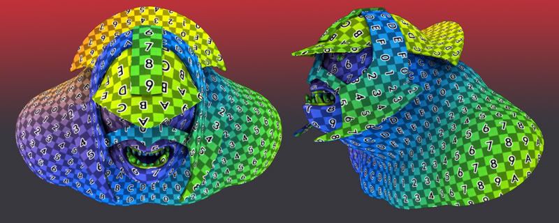
Quick update / UVs done:
1:

-
04/03/2010 at 7:32 pm #45401
Anonymous
InactiveReally clean mesh and UV’s, looking forward to seeing where this goes ;)
Nice idea with the Gradient too, I’m definitely nicking that! :D
-
04/03/2010 at 8:07 pm #45404
Anonymous
InactiveReally clean mesh and UV’s, looking forward to seeing where this goes ;)
Nice idea with the Gradient too, I’m definitely nicking that! :D[/quote:5dc6fd30a0]

-
04/03/2010 at 9:35 pm #45408
Anonymous
InactiveI’ve always liked that troll design from the movie. So far you have it covered. I’m looking forward to the progress.
-
07/07/2010 at 12:16 am #45961
Anonymous
InactiveNice bust dude!! Hope it’s still in progress because I’d love to see it finished.. Have you brought it into brush yet because it would be good to see some fine skin details and of course some asymmetry to make it more life like…
-
16/07/2010 at 5:55 pm #45990
Anonymous
Inactivecool man, nice tidy geometry, uvs and the design is looking spot on, looking forward to seeing more
-
17/07/2010 at 2:58 am #45992
Anonymous
Inactivedarkcult do you have a website\twitter account anything like that?
-
19/08/2010 at 9:50 am #46194
Anonymous
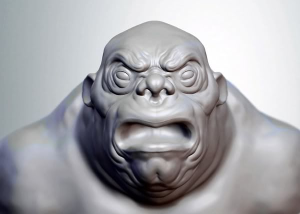
InactiveQuick update…
Had some free time so was playing with my troll…. he he …
A lot more to be done.
Hope you like it so far:
1.

-
19/08/2010 at 9:56 am #46195
Anonymous
Inactivelooking good boy, love the feel of the folds, kind of stylish, good work
-
20/08/2010 at 9:48 am #46209
Anonymous
Inactivelooking good boy, love the feel of the folds, kind of stylish, good work[/quote:caef4d2b52]
Thanks subdei!
Now that I’m looking at it again… maybe it’s too stylish. I’ve departed a lot from the origional LOTR movie character. I think I’ll start over in zBrush and stick with the concept this time ;) -
20/08/2010 at 12:19 pm #46211
Anonymous
InactiveV.Nice work!! Maybe he is too humanised to be *just* like the one from the film but I think he is great. I would keep going and not worry about reference.
I so need to lean how to unwrap uv’s evenly like that, I really should watch some tutorials.
-
20/08/2010 at 1:39 pm #46212
Anonymous
InactiveI know its not very PC to say this but he looks like he has downs, dunno if you were going for that :lol: Make sure you spend the time and break that symmetry up a bit. Nice work so far.
-
15/09/2010 at 5:36 pm #46278
Anonymous
InactiveLooks great. Looking forward to any updates.
-
-
AuthorPosts
- The forum ‘Creative Content’ is closed to new topics and replies.
